We just completed our dining room makeover and couldn't be happier with the results!
BEFORE:
Here is a before picture. Not terrible, but it definitely needed some updating!
AFTER:
The beadboard ceiling is original to the house. It was worth every blister! :-)
This painting is really what inspired the decor in the room. A dear friend saw a picture of Justus and I and surprised us by painting it. Although I would never have chosen to have myself painted, I love it as this is one of my favorite moments (I had just had our second daughter, Rosetta) and the painting captures every feeling so beautifully. When it was given to me, I struggled with where to display it, but somehow it seemed to fit best in the dining room.
The buffet is also original to the house and still has the original hardware.
I decided to paint the interior a subtle gray blue.
This cubby is also an original built in... I believe it was used for a telephone but I don't know much about the history of that (if you do, please share!). I sewed the curtains... so simple... and so affordable! The dining room is located between the kitchen and the living room, so I was hoping to find fabric that would tie together the hints of blue in the kitchen and the red in the living room. The fabric is by Waverly.
Moving around the room (the room is large... over 200 square feet, which is why refinishing the ceiling was such a painful process).
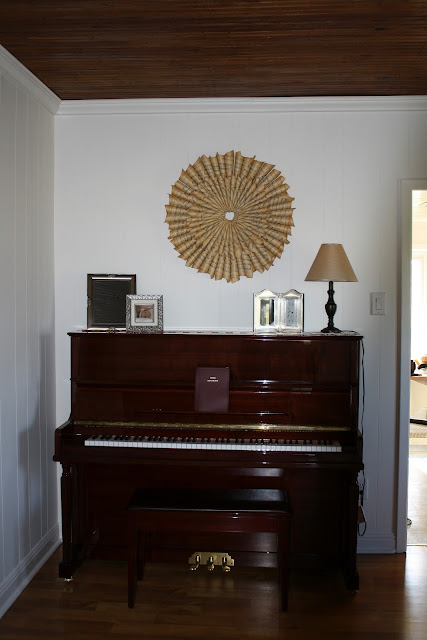
Above the piano is an antique sheet music wreath. You can find the tutorial here .
The last wall contains a toy box for the girls and an antique piano stool that once belonged to my husband's stepdad's grandfather. I love that it found a home with us. The wall is empty for a reason... I hope to find the perfect antique clock one day to hang there!
This tray is also very special to me, as it was painted by a dear friend. It helps to have such talented friends! ;-)
The one remaining project I have in the room is the chairs! I can't decide between long white dining room chair slipcovers or if I should simply reupholster the fabric with some white twill... I would love your opinion... let me know what you think!


wow, this room is increadable! I thought the before was the after until I saw the rest of the pictures ;) The paintings are amazing, particularly the one of you and your husband. And the resoration is fantastic. All of the original woodwork and old details shine!
ReplyDeleteA beautiful home! Thanks for sharing your blog.
ReplyDeleteYour ceilings are dramatic coupled with the light walls! Beautiful. I'm definitely checking out the sheet music sunburst tutorial. Something like that would be perfect with my antique piano, too. Thanks for sharing.
ReplyDeleteGlad you liked it, Calista! I think the sheet music wreath would look lovely with an antique piano.
DeleteWhat a great room. I loved every detail, but the painting stole my heart.
ReplyDeleteI just found your blog and saw the job you did on your ceiling. This dining room is incredible.
ReplyDeleteSo lovely and rich.
I love it.
The room is breathtaking. The art is fantastic!! I know moving into an older home is a LOT of work, however when you look at this room, surely your heart goes pitter patter....mine did :)
ReplyDeleteI feel like a stalker but really I'm not. Your dining room is simply beautiful. That ceiling is fantastic. Everything is just perfect.
ReplyDeleteOh, this made me laugh! Thank you so much - I'm glad you like it.
DeleteReally a great job! Love the old homes and seeing them restored to the times when they were so treasured! You can feel the love!
ReplyDeleteI love the painting the most. I can't even imagine having a friend do that for me. The ceiling is awesome, reminds me of my grandmother's. I would go with long white slipcovers. Just saying I think they would look fab and add character. Cytnhia
ReplyDeleteI love the character older homes have! The "telephone niche" or nook was common to homes built in the 30's & 40's.
ReplyDeleteI love the dining room. And adore that original art from your friend. We had a similar surprise from a dear friend. At our daughter's christening he presented us with an original sketch from our birth announcement. It was a shot of when our then 3 year old saw his baby sister for the first time. Needless to say, it made me cry like a baby ... and has a prominent space in our living room!
ReplyDelete:)
Linda
Reupholster, I feel like slipcovers are covering up ugly. It looks cheap.
ReplyDeleteLove the dining room hutch, would you be so kind as to share the paint colors with us…. the blue and white in particular. Thanks, love the blog.
ReplyDeleteThank you so much! The white is Benjamin Moore Simply White and the blue gray is also from Benjamin Moore, but I can't recall the color. I'll see if I still have the paint can. :-)
DeleteI still had the paint can! The color is Silver Gray by Benjamin Moore (but it definitely looks more blue than gray).
Delete